Anatomy of a Junction
Ever wondered about the fairness of a road junction? Or why you prefer some crossings and avoid others? I know I’m often willing to walk a few hundred meters more if by that I can avoid an uglier underground walkway.
Let me show you a very simple, actually trivial, method that can help you quantify what kind of traffic is allowed to go fast while the rest is standing at a red light.
Take a look at this junction as screenshotted from
Google Maps’ satellite view.
Or the same vicinity but without a satellite view in
OpenStreetMap.
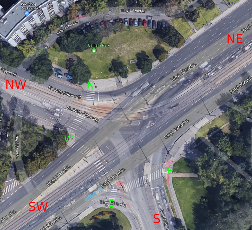
I recommend you follow the link to Google Maps and zoom in, or even use Street View to familiarize yourself with the ways through this junction both as a pedestrian and as a car driver. For now we ignore everything else: trams, cyclists, wheelchair users, etc. You won’t be surprised by what you see. It’s a usual junction in this part of the world.
This is a junction with heavy traffic. The northeast direction leads to a major bridge shortly. That road also separates an older, downtown like, mixed-use area to the north and a newer, single-use business park to the south. I chose this particular junction because it’s just a few hundred meters away from an office building where I worked for years.
That’s key. Because if you don’t put yourself in the shoes of a user of this junction, then you can’t experience it and have no perspective to judge it. Now you’ve probably never been to this exact junction. But you likely used dozens just like this. Feel free to replace it with one you cross every day.
So what time does it take to get through? We could sit down and measure the actual time people wait, but that’s a lot of work. There are good proxies of the waiting time, that can be observed instantly. For example the number of points where conflicts are possible. Traffic lights. Places without traffic lights, but where one party has to yield to another to avoid an accident. A major crossing is a system of multiple minor crossings. Let’s look at this system and count the minor elements.
Here is the number of controlled and uncontrolled crossings for a car:
| from | to | allowed | # of traffic lights | # of uncontrolled crossings | total |
|---|---|---|---|---|---|
| NW | SW | yes | 1 | 0 | 1 |
| NW [1] | SW | yes | 0 | 2 | 2 |
| NW | S | yes | 1 | 0 | 1 |
| NW | NE | yes | 1 | 0 | 1 |
| SW | S | yes | 0 | 1 | 1 |
| SW | NE | yes | 1 | 0 | 1 |
| SW | NW | no | n/a | n/a | n/a |
| S | NE | yes | 1 | 0 | 1 |
| S | NW | no | n/a | n/a | n/a |
| S | SW | no | n/a | n/a | n/a |
| NE | NW | yes | 0 | 1 | 1 |
| NE | SW | yes | 1 | 0 | 1 |
| NE | S | yes | 1 | 0 | 1 |
| average [2] | 75% | 0.78 | 0.22 | 1.00 | |
Notes:
- Some directions can be taken in alternative ways. For the NW-SW direction there are even more (unlisted) options if you look a bit further on the map.
- Excluding no turn directions and alternative ways.
And here’s the same for a pedestrian:
| from | to | allowed | # of traffic lights | # of uncontrolled crossings | total |
|---|---|---|---|---|---|
| N | W | yes | 1 | 1 | 2 |
| N | S | yes | 3 | 2 | 5 |
| N | E | yes | 5 | 1 | 6 |
| W | S | yes | 2 | 1 | 3 |
| W | E | yes | 4 | 0 | 4 |
| S | E | yes | 2 | 1 | 3 |
| average | 100% | 2.83 | 1.00 | 3.83 | |
The table is simpler, because pedestrian crossings are bi-directional. But focus on the numbers. Yes, those are real. Take another look at Street View if you don’t believe them. Pedestrians have to make almost four times as many crossings as cars have. For example there’s no zebra crossing from north to east. If you want to go from north to east, you have to go from north to west to south to east. With extra traffic lights on midway pedestrian islands.
What do these numbers mean? Clearly time is only one measure of the cost of crossing. I know that after an accident I had, with pain in my leg, I went for the shortest distance for a few weeks. But usually I go for the shortest time. We didn’t even measure time, but counted crossings instead. The crossing time is definitely not simply proportional to the number of crossings. Traffic lights work in a synchronized cycle. Crossing 5 consecutive lights does not take 5 times of crossing a single light. However please notice, that even if not proportionally, but the higher the number of crossings, the higher is the total crossing time.
I don’t even want to get into traffic light cycles and the probabilities of which phase of the cycle you arrive.
The plain, unweighted average is also methodically unsound. Done properly, we should weigh the directions by the number of users of those directions. However the lowest pedestrian cost is higher than the highest cost for a car. So there’s no such weighing that would change the fact that cars clearly have higher priority here.
In my experience that is usually not consciously recognized by most users of city infrastructure. Neither in a car, nor walking. It registers as a vague feeling, a nuisance maybe, but not as a conscious thougth. On the other hand it does affect people’s decisions of going this way or that way. Or choosing the mode of transportation. In the long term it does affect their behavior. This simple counting turns the vague feeling into a clear thought.
There are well known design patterns for intersections with different priorities. The above example gave cars preference. But let’s take a smaller four-way intersection with four zebra crossings controlled by traffic lights for all users. No pedestrian islands. If you count the crossings the same way (note, left turning cars have two crossings) you realize it gives roughly equal access to cars and pedestrians.
Count again for a diagonal crossing. (As I learned while writing this post it’s also called a pedestrian scramble.) It prefers walking:
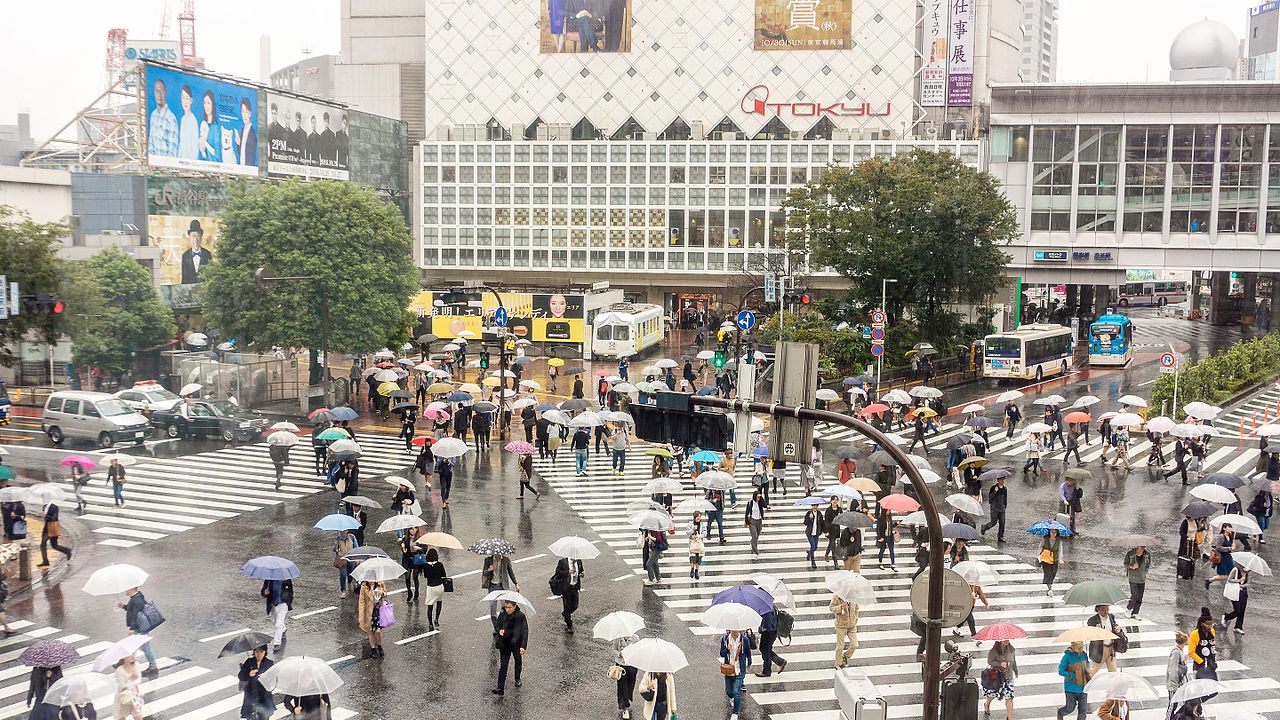
I remember that until I walked a diagonal crossing for the first time in my life far away from home, it was unthinkable for me. The behavior was all okay, I crossed smaller, unmarked intersections diagonally all the time. But that it can be made official and be turned into infrastructure. Wow! That was eye opening. Despite seeing images of it before, I did not recognize the preference encoded in it until I walked it. If you never saw one first hand it may be interesting to see one in motion. And it’s also fun to watch the reactions of people unfamiliar to the idea.
Another rarely recognized point is that infrastructure is designed by people, financed by people, built by people and is maintained by people. Infrastructure also suggests and enforces rules made by people. In other words it’s an objectified form of social relations. Not nature, not relations of people to objects, but relations of people to people.
I also used a kind-of traffic engineering terminology above, writing about cars and pedestrians. But people sit in cars. So a configuration of infrastructure prioritizes one person’s time (or movement) over the other’s.
Giving a person in a car higher priority over one walking: Is that a problem? Not necessarily. I believe there are situations where the person in the car should have priority, and other times and places where the one walking should have it and even others where pedestrians and car drivers should have fair access.
Looking at it from one step further it tells a lot though about the values and norms of a society. Without having access to statistics it’s obvious that my home city (Budapest) has lots of intersections preferring cars and it also has lots of relatively fair intersections. There’s not one pedestrian scramble in the whole city. That already tells you this society values the time of a person sitting in a car more than of a person walking. That is the car is a status symbol. Despite the quite high penetration of car ownership it still is.
One more step back. As in most of Europe, providing pedestrian access is a must. There’s legislation about that. With a few exceptions (like national highways) pedestrian walkways have to be built, or the side of the road have to be walkable. The original example in this post provides hardly more than the legal minimum. If you took away a single zebra crossing, not all directions would be connected by walking. It is fully optimized for people in cars at a certain technological level. Every allowed direction has the cost of 1. Though a technological upgrade could open up further optimizations. For example eliminating level crossings by building over or underpasses.
One more step back. The difference in cultural and legal norms (and access to capital) can lead to exploration of the technological options. Like the way Texas interchanges have more levels than the buildings around. But it can also lead to severely restricting the options and safety of a class of users.
If you found this post interesting, I also recommend that you read about the quite famous Desire Lines analysis of the company Copenhagenize. That paper takes the simple observational analysis of an intersection way further. Their method is not static, but dynamic. They are able to draw conclusions about not just the behaviors but the wants of the participants. The introductory blog post above unfortunately has a broken link at the very end to the paper, but let me fix that for you.